“`html
Candlestick Charts with Matplotlib Finance
Matplotlib, primarily known for general-purpose plotting in Python, also offers powerful tools for financial data visualization through its `mplfinance` library. One of the most recognizable and informative visualizations is the candlestick chart, widely used to analyze price movements of securities over time.
Candlestick charts provide a concise representation of the open, high, low, and close prices for a given period (e.g., a day, week, or month). Each candlestick displays this information visually. The body of the candle represents the range between the open and close prices. A green or white body typically indicates that the closing price was higher than the opening price (a bullish candle), while a red or black body suggests the closing price was lower than the opening price (a bearish candle).
Lines extending above and below the body, known as “wicks” or “shadows,” represent the high and low prices for the period. The upper wick extends from the top of the body to the highest price, and the lower wick extends from the bottom of the body to the lowest price.
Using `mplfinance`
To create candlestick charts using `mplfinance`, you first need to install the library:
pip install mplfinance Then, you’ll need your financial data in a suitable format. `mplfinance` expects a Pandas DataFrame with a DatetimeIndex and columns named ‘Open’, ‘High’, ‘Low’, and ‘Close’ (OHLC). A ‘Volume’ column is optional.
Here’s a basic example:
import pandas as pd import mplfinance as mpf # Assume 'df' is your Pandas DataFrame with OHLC data and a DatetimeIndex mpf.plot(df, type='candle', style='yahoo', title='Candlestick Chart', ylabel='Price') In this example:
- `mpf.plot()` is the main function for creating the chart.
- `df` is your Pandas DataFrame containing the data.
- `type=’candle’` specifies that you want a candlestick chart.
- `style=’yahoo’` applies a pre-defined style, enhancing readability. Other styles include ‘default’, ‘binance’, and custom styles can be defined.
- `title` sets the title of the chart.
- `ylabel` sets the label for the y-axis (price).
Customization Options
`mplfinance` offers a wealth of customization options:
- Volume: Display volume bars below the candlestick chart using `volume=True`.
- Moving Averages: Overlay moving averages (e.g., 20-day and 50-day) using the `mav` parameter: `mav=(20, 50)`.
- Custom Colors: Define custom colors for bullish and bearish candles, wicks, and volume bars.
- Technical Indicators: Integrate various technical indicators like Relative Strength Index (RSI) or Moving Average Convergence Divergence (MACD). `mplfinance` has built-in support for some indicators, and you can create custom panels for displaying others.
- Axes: Customize the axes labels, grid lines, and tick locations.
- Saving to File: Save the chart to a file using `savefig=’filename.png’`.
Candlestick charts are a crucial tool for technical analysis, providing a clear visual representation of price action. `mplfinance` in Matplotlib makes it easy to create and customize these charts in Python, enabling you to gain valuable insights into market trends and potential trading opportunities.
“`
 800×575 matplotlib finance import candlestick ohlc bios pics from mybios.me
  7200×5175 adjust size candles issue matplotlib from github.com
 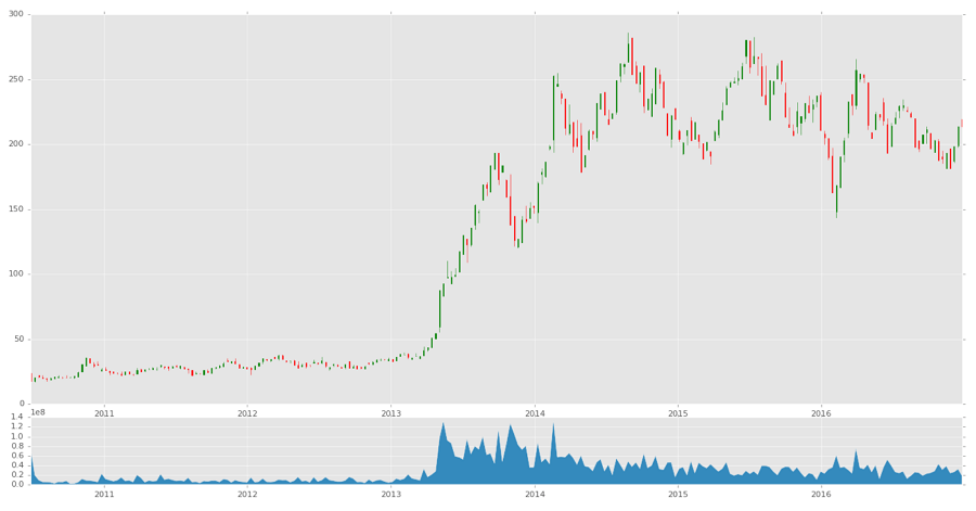 900×471 candlestick ohlc matplotlib bruin blog from officialbruinsshop.com
  474×349 add number symbol abovebelow candle chart mplfinance from github.com
  700×340 python intraday candlestick charts matplotlib stack overflow from stackoverflow.com